Uploaded by Background Pony #3277
 1140x1688 PNG 759 kB
Interested in advertising on Derpibooru? Click here for information!
Pony Arts & Prints!

Help fund the $15 daily operational cost of Derpibooru - support us financially!

Description

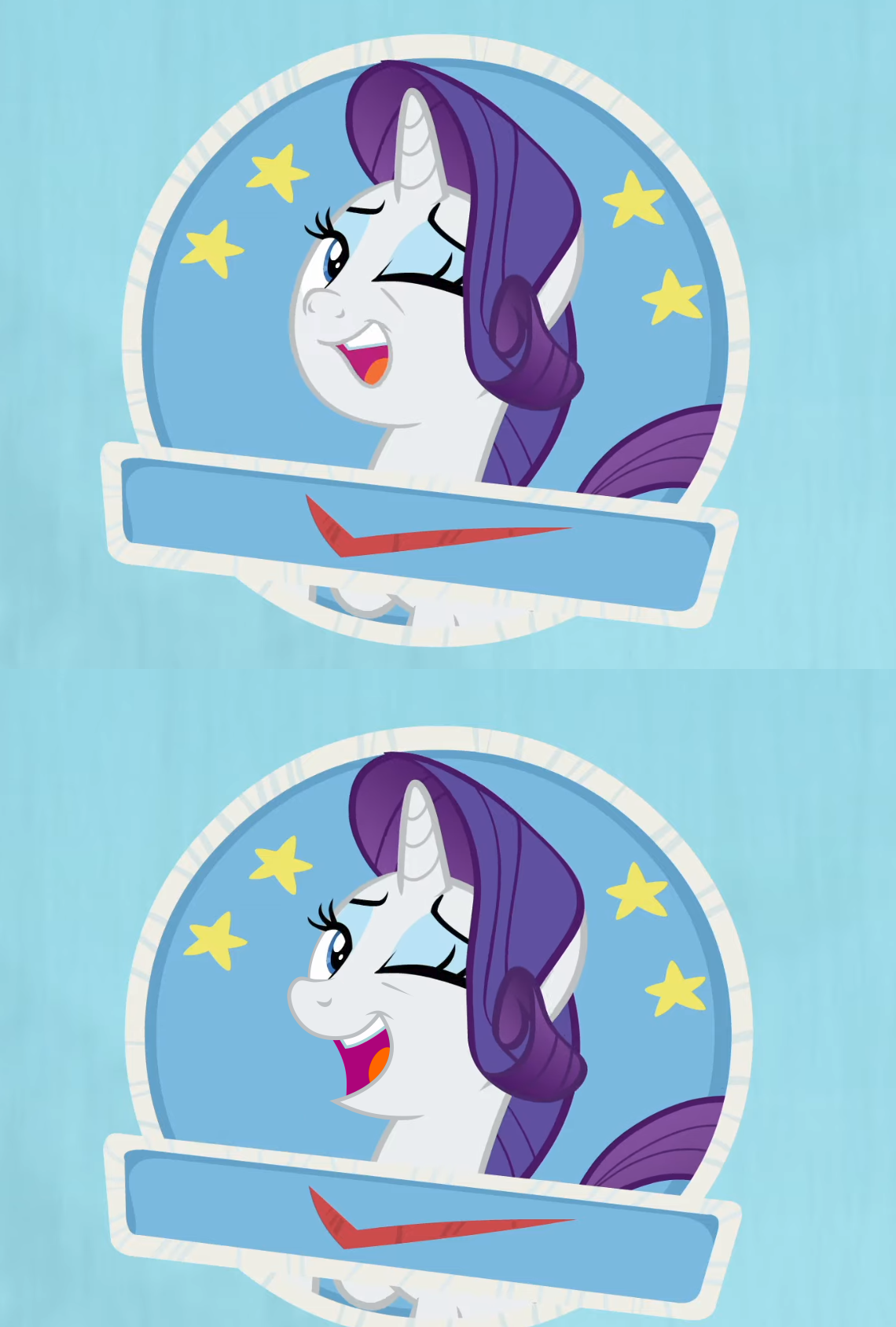
Which one is the original?  
Which one look better?

safe2196620 edit174781 edited screencap91725 screencap297653 rarity219400 pony1627031 unicorn549101 g42052509 she's all yak1314 check mark117 drama3327 female1827832 looking at you264489 mare757378 one eye closed46576 rarity's muzzle drama1 seal of approval83 smiling405412 solo1444406 stamp of approval46 wink33395

Comments

Syntax quick reference: **bold** *italic* ||hide text|| `code` __underline__ ~~strike~~ ^sup^ %sub%

Detailed syntax guide

TheThunderPony
An Artist Who Rocks - 100+ images under their artist tag
Artist -

The Pank is dank.
@AWGear  
It is sticking out a little. And indeed, considering perspective, the top is more accurate. She is, after all, in a 3 1/4 view.  
Although, maybe to be completely accurate, her muzzle should be somewhere in-between the two.
AWGear
Solar Supporter - Fought against the New Lunar Republic rebellion on the side of the Solar Deity (April Fools 2023).
Roseluck - Had their OC in the 2023 Derpibooru Collab.
A Lovely Nightmare Night - Celebrated the 12th anniversary of MLP:FIM!
Elements of Harmony - Had an OC in the 2022 Community Collab
Non-Fungible Trixie -
Twinkling Balloon - Took part in the 2021 community collab.
Ten years of changes - Celebrated the 10th anniversary of MLP:FiM!
An Artist Who Rocks - 100+ images under their artist tag
The Magic of Friendship Grows - For helping others attend the 2020 Community Collab
Friendship, Art, and Magic (2020) - Took part in the 2020 Community Collab

The Devil's Advocate
I don’t think that perspective is messed up at the bottom one. If anything, the snout on the original one looks much shorter than it would have from the side. It looks like the size of a human nose. If anything, it should still be sticking out a little. The edit looks better if you concider perspective, as Rarity is more turned to the side, than forward.
TheThunderPony
An Artist Who Rocks - 100+ images under their artist tag
Artist -

The Pank is dank.
I dunno, I think the description should’ve said, “Which one do you like more?”  
The original is clearly trying to be more 3D. But, the edit is sticking to 2D, ignoring the perspective for preservation of style.  
I personally, like the original. The team has been doing that a lot this Season too.
Background Pony #DE54
@Background Pony #7FFA  
Then this same fandom put its best “Genius at work” t shirt go to the cons exhaling self satisfied smugness and snort to the staff “i hope someone got fired for that blunder”
Background Pony #631A
Still baffles the mind how the fandom does the animators’ job 100x better, for free
still baffles me how a minor edit to one frame of a 20+ minute animated episode that takes a team literally weeks to make somehow means the fandom is better than the people who do this as a job.
Background Pony #FBA2
Still baffles the mind how the fandom does the animators’ job 100x better, for free