Uploaded by spookitty 


1429x4035 PNG 2.27 MB
Interested in advertising on Derpibooru? Click here for information!

Help fund the $15 daily operational cost of Derpibooru - support us financially!
Description
PTA alpha version 0.01.1 released!
Here’s a bug fix to version 0.01! This will be the last version of this build until the next update. Also included is a new SFW version for all you other fans out there to enjoy!
https://www.patreon.com/posts/16735340
Here’s a bug fix to version 0.01! This will be the last version of this build until the next update. Also included is a new SFW version for all you other fans out there to enjoy!
https://www.patreon.com/posts/16735340
Source
not provided yet
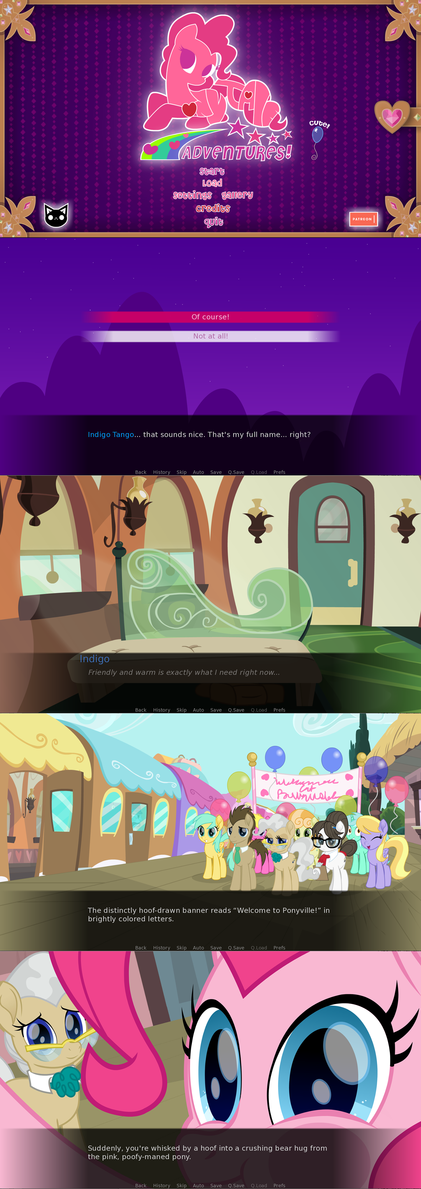
You’re joking, right? How is that hack job supposed to be better than the original logo? The original looks like Pinkie with the title worked in to the shape of her body. It’s cute, cleverly executed, and perfectly legible once you start actually looking at it.
You hacked her legs off and erased the outline of the tail, making that part of the logo illegible. It’s most certainly NOT an improvement.
beautiful stuff. had a good laff. thanks, komrade.
in case anyone is wondering (if it weren’t obvious), logos don’t have to depict the entire subject. it can portray the most notable parts of the subject that it’s for. in the case of my edit, the head (i know it seems decapitated but i’ve seen logos where it doesn’t seem so cut off) and the tail. some of the most important features of pinkie’s image. it works because people here can recognize what it’s describing.
again, it was a quick, very rough edit. i didn’t mean for it to be perfect.
Edited
apparently i can’t edit comments, so i’ll just add this on:
like i said, it’s unreadable. it has a very unique idea which is good, but with the letters being awkwardly smushed together, the outline’s color which is hard to tell from the pink color, and all of it being wrapped in an edgeless, seamless figure, it makes the letters rather difficult to distinguish from one another. i think that removing some of the parts of the pony should be removed and more kerning in the letters, because right now it looks like it reads pnyjae. a good logo should be at least easily readable when glossing over it.
i made a quick edit, sorry it’s not perfect but i’m super tired rn.
see how much more pronounced that looks? believe me, i know they have a great idea with that logo, no doubt. it’s the execution that needs work.
fair enough, should have made it clear that it was being described in the context of any logo. it’s ignoring a lot of basic stuff that could make it miles better.
That’s like, worlds different from being “fucking grotesque” and coming out “really fucked.”
Rude.
i should probably elaborate on what i meant: it’s unreadable. i’m thinking that it would look better if instead of a pony that looks like text, it’s text that looks like a pony, if that makes any sense.
Don’t listen to this weird hater, it’s actually a really cute logo.
knowing that not very many would associate with a game in these themes, i’m not expecting a well polished masterpiece as it’s being developed by two people.
one small nitpick though:
that logo is fucking grotesque. i can see what you were trying to pull off, but wow did it come out really fucked.
i’m sure you’ll get that sorted out since it’s only the early stages of development though. best of luck to the both of you.
Please don’t be a money grabbing piece of shit and cease and desist this game, please, we’re begging you
Sincerely,
The Brony Fandom
I really hope you didn’t just go and jinx it.
Edit: However, I hope that “meme” better be the last time I saw it in the demo.
Edited
Will i be able to date Starlight ??
When you see “The End” kitty you’ve found all the content.
Is the train station as far as i can go this version?
Slice of life and romance in Ponyville with a touch of adventure!
Ok just wanted to know since VNs can go into multiple genres and be great, but I didn’t know if you were going to do multiple genres.
Only sexual content. Don’t expect any gore or anything of that in this game. It’s not that kind of thing.
Also btw by NSFW it is it for a multitude of reasons or is it only sexual in nature?