Uploaded by Background Pony #C851
1280x692 PNG 533 kB
Interested in advertising on Derpibooru? Click here for information!
Help fund the $15 daily operational cost of Derpibooru - support us financially!
Description
No description provided.
Tags
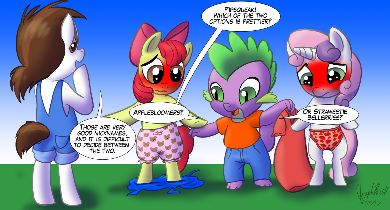
+-SH safe2185825 +-SH artist:warpwarp192915 +-SH apple bloom60336 +-SH pipsqueak3194 +-SH spike92718 +-SH sweetie belle56991 +-SH dragon86145 +-SH pony1615018 +-SH g42042193 +-SH assisted exposure2170 +-SH bipedal49927 +-SH bloomers346 +-SH blushing276567 +-SH clothed male nude female1876 +-SH clothes639605 +-SH dress62598 +-SH embarrassed15415 +-SH embarrassed underwear exposure1040 +-SH female1815638 +-SH filly98237 +-SH frilly underwear4935 +-SH humiliation2802 +-SH male554817 +-SH overalls2456 +-SH panties64147 +-SH pink underwear4686 +-SH red underwear1549 +-SH ribbon9167 +-SH strawberry underwear19 +-SH torn clothes7033 +-SH underwear79345 +-SH undressed354
Loading...
Loading...
Humiliation is really nice
“do it better yourself or don’t criticize” is a really bad argument.
A non-musician still might find a song to be bad.
A non-cook still might find food taste bad.
A non-developer might still find games to be bad.
A non-artist might find the blush here to be bad (too strong effect).
What an incredibly condescending response. In case you didn’t notice, I was trying to help them improve their art by giving an example of something that looks bad and a way that they could go about fixing it. This is that thing that people call “criticism”. Hard to improve if you don’t know what you’re doing wrong.
would you like to draw it yourself?
Adding more and more color isn’t the way to make them look more embarrassed. You reach a point where it just gets ridiculous. Use other expressions to convey it. Lowered ears, for example.