Uploaded by swordcat9 
1200x1600 JPG 1.47 MB
Interested in advertising on Derpibooru? Click here for information!
Help fund the $15 daily operational cost of Derpibooru - support us financially!
Description
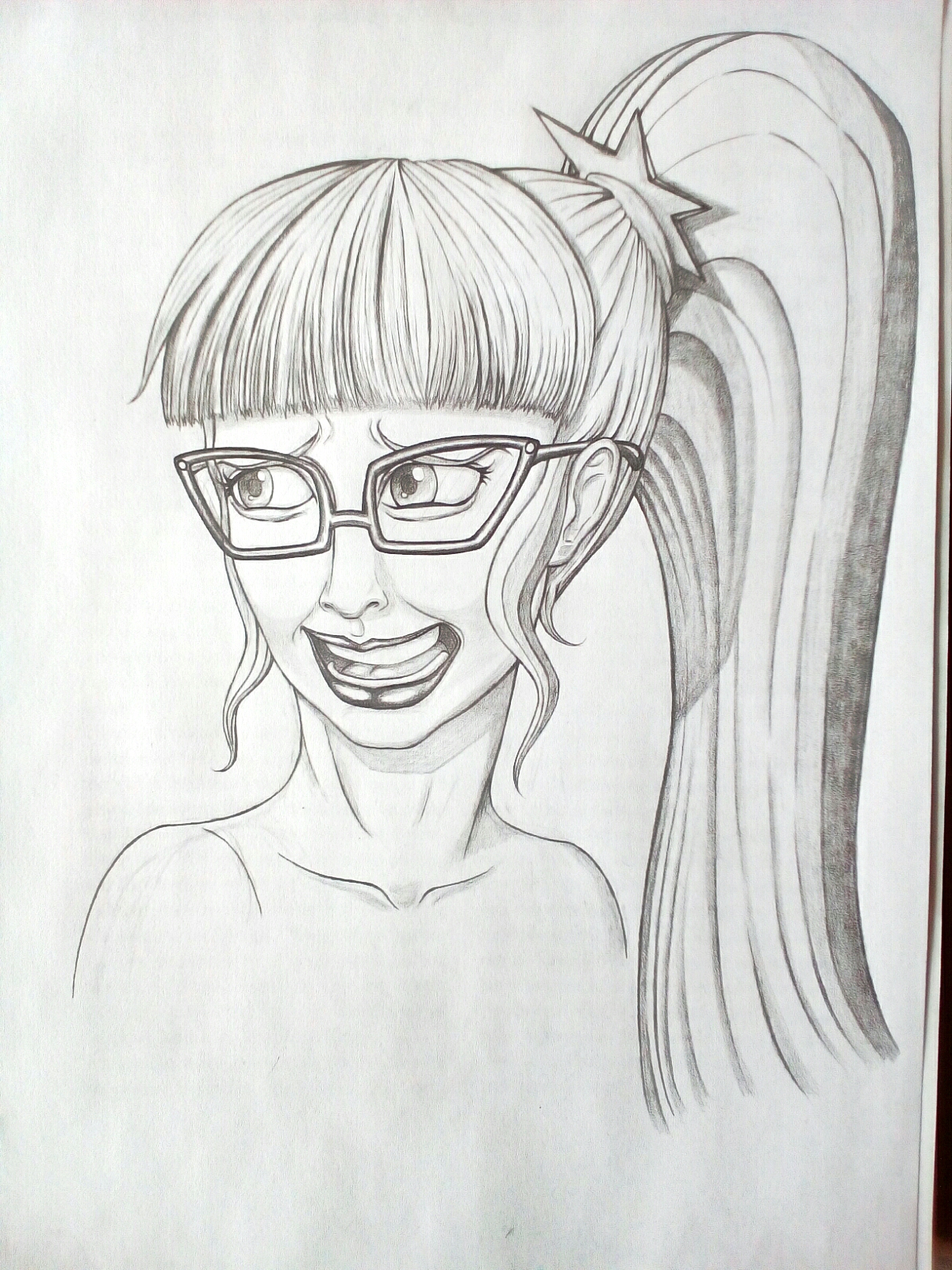
I strived for realism. This is the original.
This isn’t meant to be a duck post, I do not hate Twilight Sparkle, I am NOT trolling or trying to be mean. I was just trying to capture Twilight’s social awkwardness, thats all.
This isn’t meant to be a duck post, I do not hate Twilight Sparkle, I am NOT trolling or trying to be mean. I was just trying to capture Twilight’s social awkwardness, thats all.
Source
not provided yet
Edited
You’re right about the teeth. And yes I do know (in theory) how to draw them. The jawline and gums are actually round, the teeth also lack proportion and seem to sloping down unevenly. I intentionally tried to leave the teeth cartoony and anime looking. I planned on adding detail to them toward the end but instead decided to just run with what I had. Call me lazy or just rash, but I thought I was done.
Female lips are meant to be full, but there is something wrong with mine in this picture, there’s no denying that. Perhaps I added too much tone or they are the wrong shape.
All in all though, this drawing was an experiment. I geuss I got carried away by the excitement of trying to draw an equestria girl in real life. I suppose I bit off more than I could chew, unfortunately my humble talents aren’t up to the challenge of drawing a person realistically yet.
But that doesn’t matter, I’m glad I learned something from you guys. I geuss it’s easy to get carried away by your own work and think it’s good when it actually isn’t, but to be fair I did spend hours slaving over this, lol, I think anyone would feel the same after putting so much effort into it.
Edited
I’m looking at the full-size image and it’s still as bad as the thumbnail led me to believe. Don’t speak for others, not sugarcoat it for the artist.
Artist: my primary issue is her mouth. The lips are too full and there is just too much teeth going on. Teeth have got to be the one thing that seems hardest to pull off, even if it is simplified. Tone all of that down and I think you’ll be surprised by the results. Props to you for taking criticism like a champ. Too many artists fly off the fucking handle.
As I understand it there are, broadly speaking, two types of art: 1.tone subordinated to line (where line is the important element and tone is almost omitted,like in caricatures) and 2. Line subordinated to tone (where line is the most important element and tone is all but omitted, this is the more realistic looking art).
As for painting,the painter expresses tone using colors alone, a painter does not shade.
The general rule in any classical art is to simplify the form (in other words deconstruct it to see what it made of then put it back together, all done in your head and on paper/canvas). Even modern art styles and techniques still have to create bulk and form while maintaining character and consistency in their work.
This means you have put down the big picture and general form, leaving details for last or leaving them out altogether. If you wanted to draw a tree you wouldn’t waste time on each individual leaf, you’d bunch them together into bigger groups, thus simplifying your task.
Sure, there’s nothing wrong with pursuing a simpler art style. It comes with challenges of its own, like conveying complex expressions with simple shapes. I’m amazed how caricature cartoonists are able to deconstruct the appearance of a celebrity and draw it with just a handful of lines. Simple doesn’t have to mean primitive.
Also, when attempting a painterly look it seems like you have the deck stacked against you. There’s so much you could get wrong, of course, but even decent looking pieces tend to be overlooked in favor of vector-like images drawn with simple colors and basic shading. Check out the example below. Doesn’t look bad at all, IMHO, yet it still got tagged with ‘uncanny valley’ tag and scored only a little over a hundred upvotes. I bet it took a lot of work to make.

your current filter.In the comments below thumbnails were mentioned. I think simpler pictures tend to look just as presentable when scaled down to thumbnail size (which means they look more inviting to click on them). Sometimes thumbnails look straight up repulsive and I think it happens more often with more elaborate images.
Actually I just thought of a way to make the uncanny valley work for me. My next upload is going to be of Pinkie Pie and intentionally creepy.
I think that might work. Anyway I’m not gonna let this get to me! I just wanted to know what was wrong with my work and you pointed it out.
I know about some of the stuff you mentioned, I was gonna stick to a more cartoony style anyway.I just thought making the drawings look more realistic would add flare. I’m a struggling artist, I’m trying to learn to draw better, thats why I was trying out new styles and techniques. But it looks like I was wrong.
Geuss I’ll go back to a more anime style for now, it’s easier anyway. Thanks for the vote of confidence.
Edited
Uncanny valley doesn’t mean excessive realism. It’s actually hitting this middle area between completely realistic images and stylized reality. It’s when it resembles a person but looks creepily off. Your image seems to combine realistic and EG styles in a way that doesn’t seem to work.
Realism is tricky to begin with - unless you get everything just right it’s probably gonna look wrong even on the first glance. That’s probably why most artists online prefer to work with cartoony or anime styles. It’s not as easy to screw them up and even if you do they sometimes might actually benefit from that because they gain a unique stylized appearance.
Even professionals prefer to avoid realistic faces sometimes. Pixar, for instance, would use various characters like toys or animals rather than humans back when their CGI still wasn’t quite there yet. Check out this short - apparently viewers didn’t react too well to how that baby looked.
So yeah, you’re gonna need a lot of determination if you want to draw realistically. Good luck to you!
You just blew my mind. So what you’re saying is that its creepy because its too realistic!
Thank you for explaining this to me.I never thought of it this way. I was desperate to convey realism, because I wanted to capture Twilight’s appearance in my head-I wanted to know what she really looked like. I geuss I overdid it.
But still, this drawing is a stepping stone toward my future art EQG art projects.I’m trying to figure out how to draw the characters best. I had no idea realism (surrealism) could be a bad thing. Anyway,I appreciate your input.
Thanks. I’ve been working my ass off on these drawings lately. I guess it’s hard to accept when you draw something but then expectation doesn’t live up to reality. I really thought people would like this one.
Man,I never thought being an artist was so daunting!
Anyway, I geuss it’s all trial and error from this point on. I’ll just keep drawing and uploading, I’m bound to create something inspiring eventually.
Edited
Honestly,it is not as bad as people think it is. The art is good, I think the thumbnail makes it look more different than what it actually is though.
Edited
It’s not a matter of bad art. This hits the uncanny valley where the realism and intentionally awkward appearance mix to give the same effect of discomfort that real social awkwardness conveys. It’s very much like social awkwardness in reality where the effort and intention were not lacking but the expectations and tastes of others did not agree.
The merits of art and the popularity of art aren’t a perfect correlation. You conveyed what you wanted to convey very well, but her awkwardness is in itself awkward to see.
Edited
Oh well…