Uploaded by Appletank 
1920x728 JPG 118 kB
Interested in advertising on Derpibooru? Click here for information!

Help fund the $15 daily operational cost of Derpibooru - support us financially!
Description
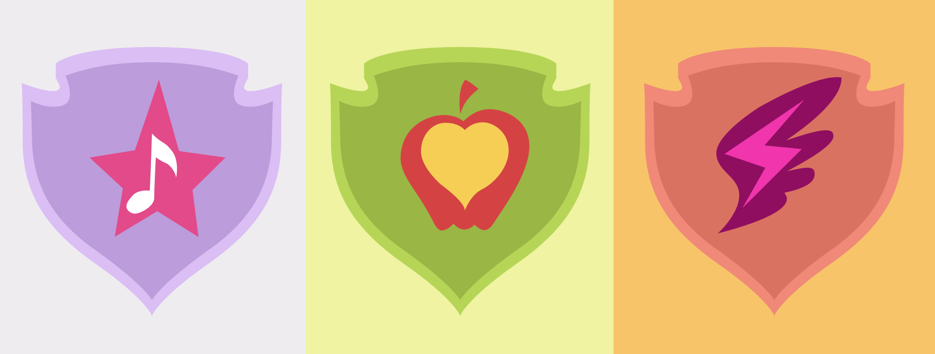
Somebody decided to redesign the cutie marks. Not mine.
Source
Let’s hope they do in season 6
Yep. This is pretty much it. They went to the trouble of creating a triple layered cutie mark but made them so small that it is hard to really make out the inner symbols. If they scaled it up just a tad then it would be perfect.
that dark magenta background and border is so freaking clashing with everything
AB’S would certainly not have a green cutie mark. She’d probably have an orangeish and reddish pinkish cutie mark. Maybe with a bit of light yellow or cream.
I do like scoot’s cutie mark design in this version, all I would say is it’d probably have more light purple and dark purple.
All in all, I do like the recolored designs but I also like the shows design. >w<
I kinda agree, the shared cutie-mark kinda implies they’re nothing without each other. (Nothing against ’em though.)
I kinda hope each CMC still gets their own individual episodes in the future, (Kinda like the Luna ones) and are still treated as individuals.
It retains the CMC’s individualities while still having aa more subtle shared motif that implies they’re connected to each other.
The should be their own individual characters more than they are crusaders.
I honestly saw it coming, they’d get their marks this season, (the fact they were less cutie-mark obsessed last season, and the whole “Cutie Mark Magic” franchise gimmick kinda clued me in) but not at the same time. I was kinda hoping they’d each get their own, “X Gets their mark” episode, but still I loved how the entire episode turned out.
My favorite episode of Season 5, and favorite CMC episode overall.
I wonder how good a single color from the cape would look. Or perhaps a different pattern for the shield background.
I know, I was just making an observation. :)
You might as well upload that to Derpibooru now if you haven’t already.
The problem with using primary colors is they get used for flags a LOT. No matter how you arrange them they’ll still look like a flag. It was either that or go Red Yellow Blue and make it look like MURRICA. Or if you really want to go the solid background route, you could give them each one of the three. As long as its some color that ties it into being the Crusader’s emblem and not just a generic shield shape.
My thoughts exactly.
Reminds of me of the flag of Romania.
Someone coaxed me to do it on another image so, crosspostan.
All changed colors come directly off of the CMC cape.