Uploaded by Clear Vision 


")


4096x2304 PNG 4.43 MB
Interested in advertising on Derpibooru? Click here for information!

Help fund the $15 daily operational cost of Derpibooru - support us financially!
Description
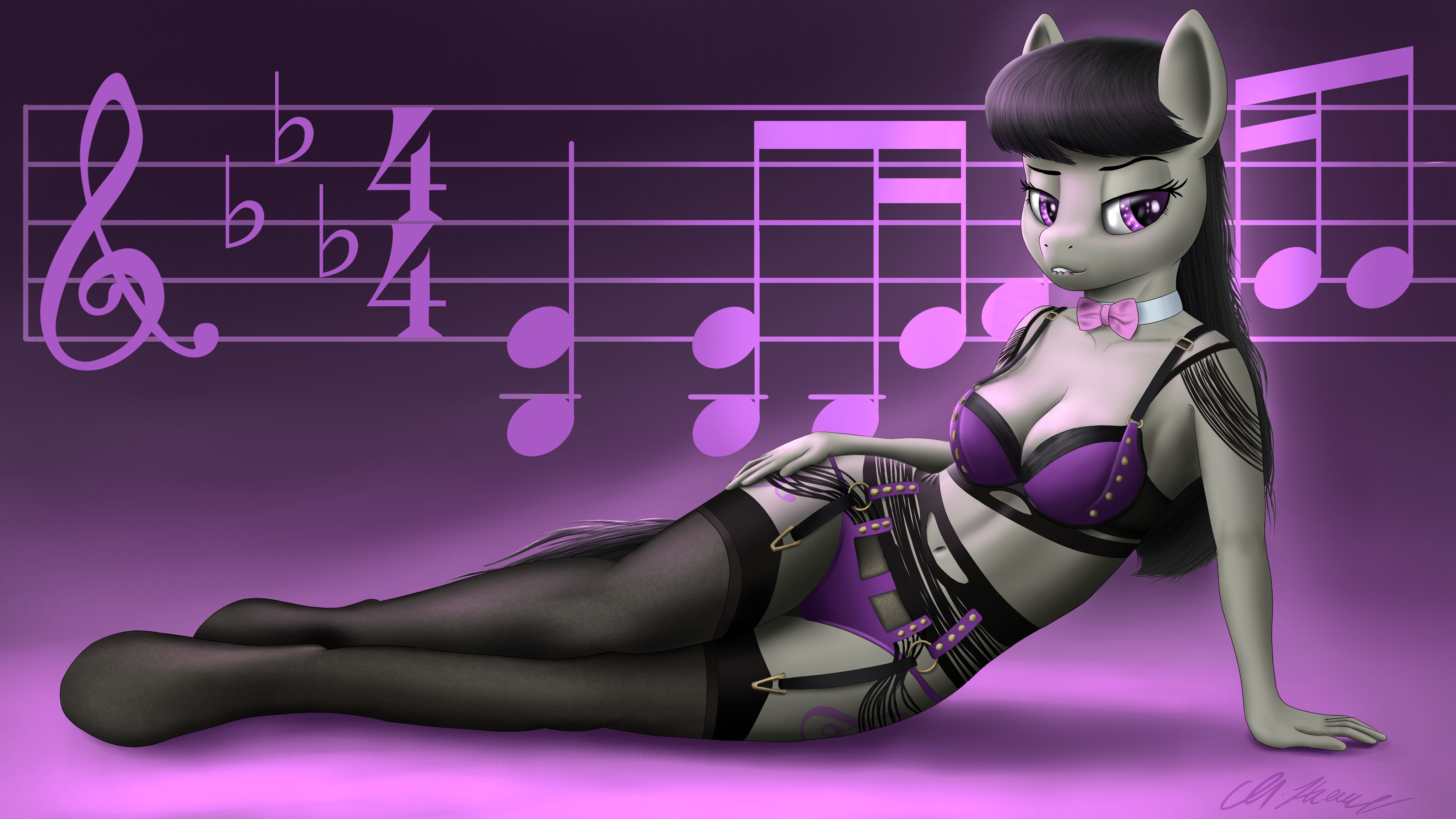
I’m testing out some new shading methods to further develop my style, so here; have a cool desktop background of ‘Tavi biting her lip in some sexy lingerie. You’re welcome :3
(Also, for those who even care, the notes in the background aren’t random. They’re the first bar for “I am Octavia”)
EDIT: holy shit this got more upvotes and faves then I expected…
===
Interested in getting a commission? Click here.
(Also, for those who even care, the notes in the background aren’t random. They’re the first bar for “I am Octavia”)
EDIT: holy shit this got more upvotes and faves then I expected…
===
Interested in getting a commission? Click here.
Edited because: addition
Maybe using the parts of the 18th and 19th beat that mark the “I am Octavia” would have made it more clear, still a clever pick
Thanks :3
@Oliver_Hancock
I knew that someone, somewhere would attempt to try and play the notes in the background whether they were random or not, and I’m assuming that someone happens to be you :D
I’m not a musician by any means, but bear in mind there’s also notes in the bass clef ledger as well that isn’t in the BG (I tried, but it didn’t look right and made the artwork look way too crowded), and that Tavi is hiding three of the notes (two by her hair, one behind her back towards the left).
I used this as a base, and despite my efforts to make any aspect of my artwork referencing real life things/objects etc. as authentic-looking as possible, I won’t write off the possibility that I somehow made a critical, embarrassing mistake which I’d have to apologise for.

your current filter.I know I am always a fan of nice pinups, I don’t think anyone here would hate seeing more like this.
That could be a fun idea, but you just have to kind of keep in mind, depending on how you do the “fluffy” effect, you may start to slip from the more realistic look that you have here to a more cartoony style depending on the implementation.
Not at all a bad thing but something to keep in mind, it can look good either way, realistic fur takes a lot of careful detail but can look amazing if done right or completely over the top if done wrong. A more abstract method can accomplish the same thing from a practical standpoint and goes with the MLP artstyle since it’s a cartoon anyway but you end up with a less impressive piece overall.
As far as line-less goes…. I’m always a fan of some really nice lines, but that’s not really because they’re better, I just like having a nice versatile outline for editing and touch ups. Line-less can look good too, you’ll know when you are making it if it looks right, you are really the only one who should decide that, your style is yours after all.
If you aren’t sure, just try all of it, more practice right?
Thanks for the lovely comment :)
Making the haze effect stronger in the eyes is one of the things I did differently with this one compared to previous drawings, but I do see what you mean. I’ll tone it down in the future, but surely I’m taking a step forward with how many upvotes and faves this received within the first 24 hours of it being up, already making it my second most favourited and upvoted image (with only one downvote!) so far which I wasn’t expecting. I will certainly make more pinup desktop wallpapers in the future with different characters if people like this sort of thing, so to anyone reading this, let me know.
On another note, other things that I want to try adding to my artstyle at some point are:
I didn’t try any of these things with Octavia though because I didn’t want to do it wrong and have it kill an otherwise great looking art piece.
Looks good to me, I like the color choice, purple looks really good with her base color, the black has a really nice contrast between the two and goes well with her hair.
If i am going to be a picky douchebag then i would say i’m not too crazy about the purple haze in her pupils, but it doesn’t actually bother me that much, I just feel like it breaks up the definition more than I’d like.
Good job.
@Background Pony #E952
Each to their own I suppose. I still don’t think I made a bad choice for her lingerie by any means, though.
When it’s this complex, I’d prefer it to be made of lace.