@Background Pony #F590
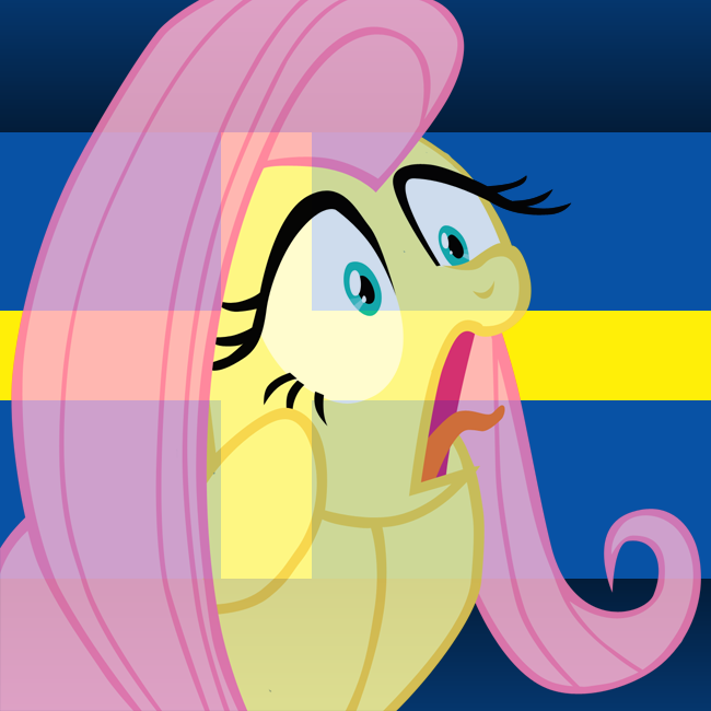
What you call a “pony knee” is a equivalent to a human heel. The anatomy makes sense, barring the fact that unguligrades in general would make terrible bipeds (if we want to be excessively realistic).
Because if he points out someone got his age wrong, he can avoid all the criticism about the shape of Chrysalis’ head.
But let’s go further.
How many joints are in her legs? From her human knee, it goes into a pony knee, and then the smallest reverse back into a foot. So she just straight up has extra knees. As it’s tagged Unguligrade anthro, that is probably what he was going for, but, well click that tag and see what that would look like properly without extra knees. Looks jarring.
Why does she cast a perfectly circular shadow directly below her. Let’s just assume that the light source is indeed directly overhead, that’s fine. So why is it this perfect circle that’s larger than their entire body. Why does the shading on the body not also follow with a overhead light source. Why doesn’t her hair cast shadows on said body. Where’s the hair’s shadow in general. Point is, the shadows are off, and that’s jarring.
Where are her hands? They’re simply not there. No, they’re not hidden by the body, they’re just not drawn in. Cross your arms just like the pose, now look in a mirror, hey look, it’s your hands! Do you see lots? No, just fingers really, but, they’re still supposed to be there.
The farther away thigh doesn’t connect with the lower leg. Hold up a flat edge to the screen and follow it. Her leg essentially makes an “s” shape, that is blocked by the front leg. They just don’t line up. This is likewise jarring.
Immensely thin neck. In fact, her neck is thinner than her arms. This contributes to the aforementioned large head look even larger. More so, it’s clearly supposed to be twisted but drawn straight on. The end result is her neck isn’t even connect correctly. jarring
Of all the criticism that can be made of this piece, the one I’m not going to throw is that it’s traced. I don’t think it is. Certainly referenced, but this is probably Toxic’s true level of ability.
are you seriously trying to argue with him? His only defense is saying “it’s your opinion” and petty provocation.
At this point i’m sure he’s doing it intentionally. He just went through another tracing scandal and he became a meme for a while, yet he’s still here posting another suspicious anthro and saying the things everyone told him to stop saying.
He’s a petty troll, he will never learn and doesn’t care about learning. He actually enjoyes being regarded as a terrible artist and person.
@Background Pony #93E8
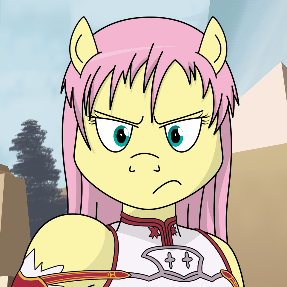
Gonna agree with this person here. The head looks astoundingly out of place and her hair goes up too far to be feasibly coming from any sort of scalp.
The character herself is also too small for the image; there’s far too much empty space going on.
I like the gradient, though. Blue to green is one of my favourite colour transitions.
The criticism is that her head looks strange. And it does, it has flat sides, like a board, trimmed down in the front. No definition, no details, just a slab of face. It is not cohesive with the body.
You can ignore criticism if you’d like, no one say’s you have to change. Clearly you must be doing something right if you have all the followers and conventions you do.
But, responding like that. That’s not beneficial to yourself or your critic.
Not responding is probably your best option, they’re not attacking, so don’t defend.