Mar 19 2018 Site Update Thread
LightningBolt 


.")


 - Took part in the 2020 Community Collab")


 - Celebrated Derpibooru's seventh year anniversary with friends")


![Thread Starter - [NO SPOILER, LEAK-FREE] Season 8 Discussion and Speculation: Discovery Family airings](https://derpicdn.net/badges/2017/7/2/0bd59d4eff9c3aeaad.svg "Thread Starter - [NO SPOILER, LEAK-FREE] Season 8 Discussion and Speculation: Discovery Family airings")

 - Celebrated Derpibooru's six year anniversary with friends.")


 - Celebrated Derpibooru's five year anniversary with friends.")


Senior Moderator
Undead inside
Opinions upcoming:
I prefer left aligned layout and honestly if we have two layouts, we should make sure both look good for what they are.
I prefer it when the tags stretch the whole length of the page.
I also prefer the Description box actually say what it’s for above the description.
I prefer left aligned layout and honestly if we have two layouts, we should make sure both look good for what they are.
I prefer it when the tags stretch the whole length of the page.
I also prefer the Description box actually say what it’s for above the description.

nirvash 

The cutest griffon!
@LightningBolt
I can agree with all these opinions!
Tags look good stretched across the page, comments not so much. Also, it is odd that the top bar now has a max width instead of stretching across the screen.
I can agree with all these opinions!
Tags look good stretched across the page, comments not so much. Also, it is odd that the top bar now has a max width instead of stretching across the screen.

WingbeatPony 

Tag horse
@CrashGordon94
That “box” is actually what controls the width of the description, comments, everything. Thankfully it’s a class that gives the div its style, not an ID, so it’d be trivial to rework it into a CSS sandwich of narrow, wide, narrow.
@LightningBolt
You make very good points. The part about the description feels like it was lost in the shuffle, and wouldn’t hurt to reintroduce a properly-colored title bar now that it’s actually worth bringing attention to.
One further point about the description is that having it always visible is good for always having the edit button visible for the OP, but less so for other users now that its only purpose is to tell you that there’s no description. I think I mentioned it before with the thought that the sample text could read “Add a description,” but this thread moves faster than the poor dev(s) can keep up with.
LightningBolt
Senior Moderator
Undead inside
@nirvash
Yeah, forgot to mention the top bar. Looks better the whole length across.
Not everything was designed to be the same length across.
@WingbeatPony
Agreed on the description part.
Yeah, forgot to mention the top bar. Looks better the whole length across.
Not everything was designed to be the same length across.
@WingbeatPony
Agreed on the description part.

gexon_pane
私は一度住んでいた
I can agree with both types of layout, but imo the left-aligned one feels more logical on image boorus than the centered one. Also, imho if a text isn’t centered itself, it should be a bit skewed to the side anyway.
WingbeatPony
Tag horse
Kind of a cross-post from the other thread, but I know not everyone is following the conversation there. I found a (crummy) screenshot of what the old metabar looked like from one of my livestreams, and made a before and after, here:

I look at it this way. From a design and UX perspective, every thing I can see that’s changed in the current layout, my response has been “maybe it would be better if we tried X” and it turns out that X is how it looked before the update. It’s not just a case of familiarity or status quo, it really is overall a better design.
But I don’t think that should preclude all of the planned changes, either. Adding artist credit (to the old design) wouldn’t detract from it, and we’ve already thought through what to do in the case of multiple or zero artists, and even if all the image has is an editor tag. Making the view buttons less redundant through the use of a user setting is a good idea, too; so far anyone I’ve talked to has one type they prefer and stick to, but they don’t all prefer the same type. And, of course, anything going on under the hood to streamline the code is a good thing. Even reducing the visibility of uploader badges is something worth trying once we go back to the drawing board.
So my wholehearted recommendation is, if forward is the only direction to go, to make the layout behave like the old layout as exactly as possible with whatever CSS improvements reduce spaghetti code, and then move forward with the three good changes since they really are what should have been done in the first place to solve the issues we were having.

CruFox ")
When the resolution and file size was in the same line as uploader it was better. Now it only moves the clickable buttons more to the right. I don’t click on resolution. I click on “view short” link a lot when I want to send art from the site to friends. The default “PPM/copy image url” on the image itself gives me the long link and this looks just bad when send to someone thus I always used “view short”. Because it’s clickable I don’t like it positioned this far to the right side, moved even further right because of the resolution info. The old layout was better because the view button was close to the image, because image is left aligned, it was easily accessible without moving the cursor a lot. I click on fav/upvote and then the next thing I want to do is to copy the short link, so voting buttons and view/download buttons should be as close to each other as possible.
I also use two monitors so the center of my vision on DB (which I view on my right monitor because left centered images, tags and comments and everything) with left layout is the left side of my right monitor. So the “VS” button on the right are annoying.
I would like the option to just have short link under “View” very much! I can’t recall any occasion when I used the long link.
Tag? Tag.
When the resolution and file size was in the same line as uploader it was better. Now it only moves the clickable buttons more to the right. I don’t click on resolution. I click on “view short” link a lot when I want to send art from the site to friends. The default “PPM/copy image url” on the image itself gives me the long link and this looks just bad when send to someone thus I always used “view short”. Because it’s clickable I don’t like it positioned this far to the right side, moved even further right because of the resolution info. The old layout was better because the view button was close to the image, because image is left aligned, it was easily accessible without moving the cursor a lot. I click on fav/upvote and then the next thing I want to do is to copy the short link, so voting buttons and view/download buttons should be as close to each other as possible.
I also use two monitors so the center of my vision on DB (which I view on my right monitor because left centered images, tags and comments and everything) with left layout is the left side of my right monitor. So the “VS” button on the right are annoying.
I would like the option to just have short link under “View” very much! I can’t recall any occasion when I used the long link.
WingbeatPony
Tag horse
@Crusier
For the most part, that’s what I’m saying, too. Just to elaborate on a couple of things, though: You’re right in that moving parts of the metabar to opposite sides feels awkward, the download buttons are actually stuck to the side if they have the space, regardless of how long the resolution info is. That makes them disparate from the other buttons to interact with the image without much reason.
As a side note, the hypothetical use case for the long filenames is the guy who downloads and archives images as he finds them, directly and manually, and therefore would lose metadata (tags, artist credit) off the image as he stores it locally. There are a couple other reasons to warrant that information in the filename, of about the same significance. This is why I’m okay with the feature slowly being pushed to the back seat but wouldn’t (yet) be okay with total removal. I think there might be something in the API, too, but that’s off topic.
GyroTech 


The Prettiest Catbird
@WingbeatPony
I use long file names so that I keep the artist intact on my archive of my images. I actually, after uploading new pics of my OC, download off of Derpi for the tagging information to be intact. I would be incredibly sad if that was removed.
I use long file names so that I keep the artist intact on my archive of my images. I actually, after uploading new pics of my OC, download off of Derpi for the tagging information to be intact. I would be incredibly sad if that was removed.
CrashGordon94
Alright, but that doesn’t sound like it precludes giving it a widescreen option, just that it would apply it to the other stuff.
Of course I’m not opposed to the other comments on that, just really wanting at least an option for the full-width tags/etc.
@CrashGordon94
That “box” is actually what controls the width of the description, comments, everything. Thankfully it’s a class that gives the div its style, not an ID, so it’d be trivial to rework it into a CSS sandwich of narrow, wide, narrow.
Alright, but that doesn’t sound like it precludes giving it a widescreen option, just that it would apply it to the other stuff.
Of course I’m not opposed to the other comments on that, just really wanting at least an option for the full-width tags/etc.
alidan
the download buttons feel like they don’t work,
What I mean is when I go to a drop down menu, I don’t click file or edit and expect that to be the last thing I need to do.
when I click download it can take up to 7 seconds of the download to start or even register, making it feel like its not working.
I think that the views and downloads should be separate buttons for each one
however with view, I think you could truncate that to just one button because really, if you are viewing it are the tags really relevant and if you wanted to download it, why go to view first?
granted I also see this as another area a toggle in the usercp would help, what is your view/download preference, and just have a one button does all on the image page.
alidan
I’m going to say this as someone with a large 4k monitor, for most web pages I keep the screens about 1080/720 size horizontally, however derpi and other image sites, I tend to stretch it to be closer to full 4k then 1440
Having the tags go all the way for me is not fun, I use a program called hydrus, I had to make the preview window massive to clamp down on the thumbnails even when windowed to make them manageable
There are two people you have to think of here,
Opinions upcoming:I prefer left aligned layout and honestly if we have two layouts, we should make sure both look good for what they are.
I prefer it when the tags stretch the whole length of the page.
I also prefer the Description box actually say what it’s for above the description.
I’m going to say this as someone with a large 4k monitor, for most web pages I keep the screens about 1080/720 size horizontally, however derpi and other image sites, I tend to stretch it to be closer to full 4k then 1440
Having the tags go all the way for me is not fun, I use a program called hydrus, I had to make the preview window massive to clamp down on the thumbnails even when windowed to make them manageable
There are two people you have to think of here,
- people who have a high ppi screen
- people who have a high resolution but low ppi
People with high ppi, anything you do to make the site work at 1080p or 720p will also work for them as they are going to hit 50-100% scaling anyway
but for high res low ppi, you are basically going to make it so what would currently be 4-5 lines of tags now turns into 1
honestly, every other booru I go to has the tags listed horizontally, and seeing how many tags an image can become its for a good reason. if you are able to do this and have them listed to the left of an image I think it would be good going forward.
otherwise yes, by all means expand them, but allow a user clamp on how wide it can be at its max.
The Frowning Pony
Administrator
13 blinks per minute
it can take up to 7 seconds of the download to start
This sounds like a browser/machine specific problem; the link in the dropdown isn’t any different from the old link.
gexon_pane
私は一度住んでいた
Well, I guess I’m more than okay with the new variant. Thanks for listening to the people, admins. You’re awesome.
The only little flaw now imho are oddly arranged indents in the second line of the header, but it’s gotta be the thing you yourself are willing to fix. And it’s not crytical at all.
The only little flaw now imho are oddly arranged indents in the second line of the header, but it’s gotta be the thing you yourself are willing to fix. And it’s not crytical at all.
alidan
@The Frowning Pony
oh i’m well aware it’s on my side, sometimes I click the download and it starts immediately, sometimes it takes several seconds for it to start, I just had a few windows open went to the first one and counted off 5 seconds before it started, the rest were immediate, the main issue is every other program and a good number of websites that have dropdowns like that don’t have them also be download links. other then it feeling wrong to me and preferring single links to drop down, everything else is great now.
on a side note, tried centered view… I don’t like the big open spaces on both sides, I could see it being good if I had my windows fare smaller than they are, but not something I particularly like.

stsyn .")
")

Moderator
This new width is strange
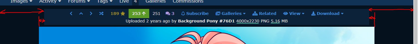
It’s not aligned with image
It’s not aligned with top bar width
It’s not aligned with comments width
And I liked bold resolution
It’s not aligned with image
It’s not aligned with top bar width
It’s not aligned with comments width
And I liked bold resolution

evan555alpha 
PSA: R0 was changed!
@Marker
All the more reason to go back to it being full width, instead of this not quite full width, but more than half width thing it’s got going on. It’d look more consistent across images.
All the more reason to go back to it being full width, instead of this not quite full width, but more than half width thing it’s got going on. It’d look more consistent across images.

PonyGhosts
#metoo
I’m sorry if it’s been mentioned, and I just missed it, but I see you went ahead and put “view with tags” in the drop-down menu instead of as its own button. How do I make it the default? I never use the short file name.
Or hasn’t that been implemented in the settings yet?
Or hasn’t that been implemented in the settings yet?
WingbeatPony
Tag horse
@HumanGhosts
I believe it is the intent to leave this as-is. Creating a user setting is far more involved on the backend. What’s neat is that this has finally made long file names available on mobile, too.
I suppose you could ask one of the people making userscripts for one that swaps the link in the dropdown with the toplevel one, but honestly with the dropdown opening instantly I do think this is something that won’t be as much of an issue as you get used to it.
PonyGhosts
#metoo
@WingbeatPony
My use case is probably not that common. I switch between tabs by holding down the right mouse button and using the scroll wheel. Once you get used to it, there’s no going back. And here’s the thing: Derpibooru has no link directly to the image from the index (like you can get in Shimmie, for example), so if I just want to save the image (and not see the thread at all), and this usually is what I want, I’ll open the image page in a new background tab, and once I have the thirty-ish images per day I want to save, I whiz through the tabs with the cursor hovering over “View.” Once I have just the images loaded in the tabs, I can save them en masse.
It’s a slightly circuitous way to recreate the direct image links in Shimmie, but it works, and thanks to the quick way I switch tabs, it barely takes any longer than if the direct links were available. But of course now I have to adjust my cursor position with every tab since the position of the “View (with tags)” option is no longer absolute.
This is a small issue in a rare use case, plus I could swap the options myself in Greasemonkey (or, now that I think about it, try to guess a direct link to insert in the index), but it seems like every update brings the site a little further away from what I would prefer.

CruFox
Tag? Tag.
@HumanGhosts
Or you could use Imagus extensions (here it is for Chrome). It lets you view an image in fullscreen without opening it in a new tab. It opens it in a box on your current tab when you hoover mouse cursor above the image. When the image is opened you can press Ctrl + S and the file will be saved under the name containing tags.
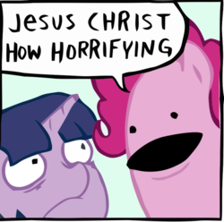
It looks like this:

As you can see even the tags are displayed. If you then press enter, the image will be opened in 100% zoom with mouse used to navigate, instead of being fit to screen height.
Or you could use Imagus extensions (here it is for Chrome). It lets you view an image in fullscreen without opening it in a new tab. It opens it in a box on your current tab when you hoover mouse cursor above the image. When the image is opened you can press Ctrl + S and the file will be saved under the name containing tags.
It looks like this:
As you can see even the tags are displayed. If you then press enter, the image will be opened in 100% zoom with mouse used to navigate, instead of being fit to screen height.
Interested in advertising on Derpibooru? Click here for information!
Help fund the $15 daily operational cost of Derpibooru - support us financially!