@Soobel
re: either draw clearly cartoony ponies or realistic horses
I don’t agree with that at all. It might be decent advice for a beginner, but you’re clearly not a beginner any more. Any point on the scale from absolute abstraction to cartoony style to photorealism can be done successfully.
What I think the person who said this actually meant, is that it’s
harder to succeed (i.e. make appealing pictures) in between cartoony style and realism. That’s true, it is harder. The challenge comes from having to balance multiple aspects of realism/style. I mentioned the realistic renderings of cartoon characters like Homer Simpson. We don’t want to accidentally create that effect. For examples,
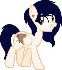
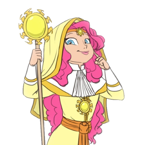
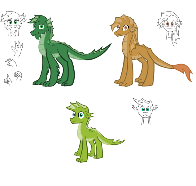
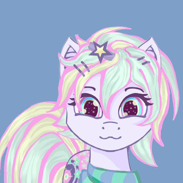
>>2495579 is a cartoon pony with teeth that are way more realistic/detailed than anything else in the picture.
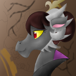
>>2290464 combines photorealistic detail level with exaggerated cartoon proportions.
>>2286109 is stylistically about the same all over, but combines human features like the eye shapes, eye position, jawline, and lips to what is otherwise intended to be a pony with a pony muzzle and pony ears.
>>125882 is fully pony shaped, but rendered in photorealistic textures.
Usually the effect isn’t quite so obvious and extreme, but can still make viewers uncomfortable.
re: draw a human face using gorilla’s anatomy
It may sound odd, but it’s true. MLP ponies are built like horses and they move like horses (as long as cartoon physics isn’t in effect). They
are stylised horses, not some alien species. Even drawing completely faithful G4 ponies, knowing horse anatomy is very useful, and when we step away from absolutely cartoony towards slightly more realistic, we should aim for more horse-like, not simply make things up based on the G4 model. Cartoon ponies and horses are just as related as cartoon humans and real humans. The proportions and detail level are different to make the cartoons cuter, but the inner workings are all the same.
re: contrast and value
Value means luminosity, i.e. how dark or light something is. Highlights should be very light, sometimes almost white, and shadows should be dark, sometimes black. If everything in the picture is somewhere in the middle range of value, it looks odd unless the scene is set in a shady mist.
Saturation would be the range of colour that goes from dull and grey to eyebreaking bright.
Hue means the sort of colour, i.e. light pale blue and deep rich blue are both blue in hue.
Contrast can be the difference between all of these, like the contrast between a light, bright red and a dark, dull green. Or it can be any combination.
some additional points
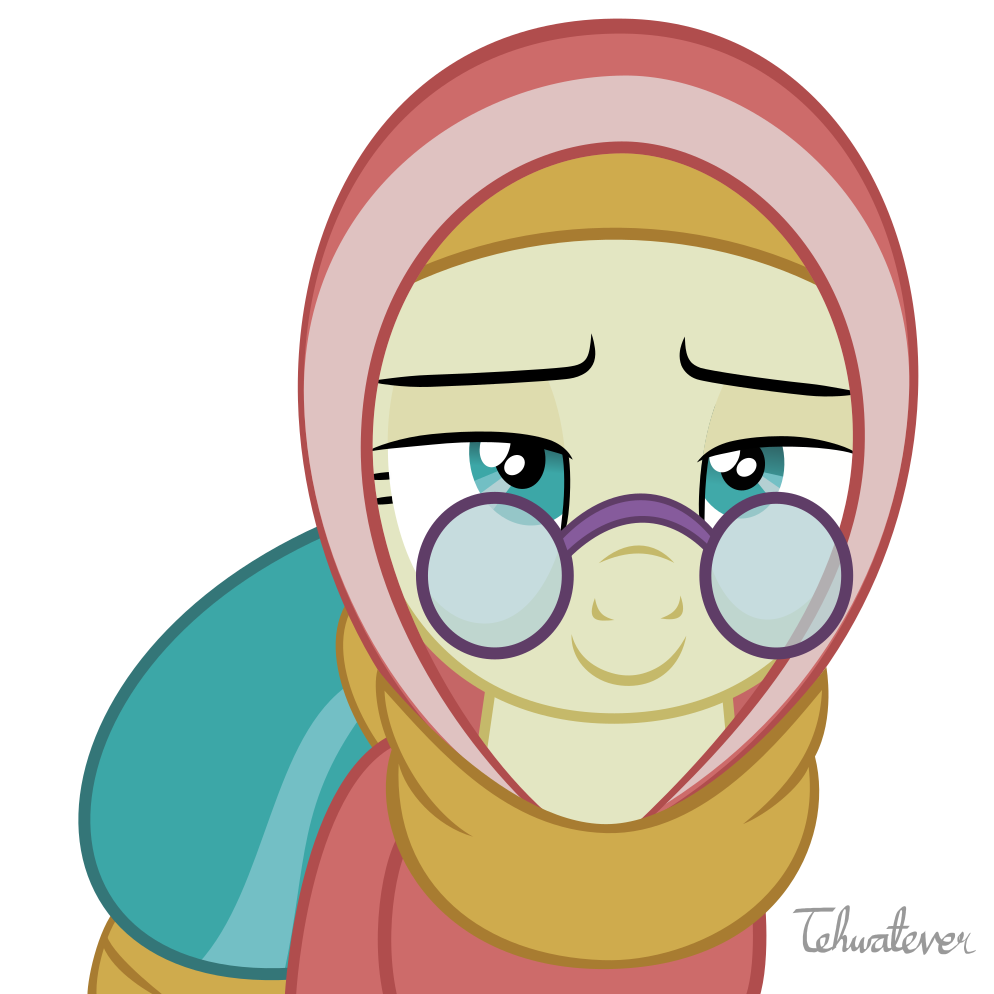
I’d like to address just the eyes for now. The eyes are set like a human’s eyes (in the front of the face), but the head is a pony’s head. Horse (and G4 pony) eyes are set towards the sides of the head, at an angle, so they can see around themselves and see predators from any angle. Humans, descending from creatures who lived in trees and needed great depth perception to make jumps, have forward-facing eyes. Other animals with forward-facing eyes tend to be predators, who need depth perception to know when to strike at their prey.
Another thing is the massive size of the iris, filling almost the entire eye. This isn’t correct for humans or ponies. It would be correct for a realistic horse, but that’s not what we have, so the expression looks directionless and odd.
So I suggest to 1. move the left eye away from the center of the face and 2. make the irises just a bit smaller.
https://imgur.com/a/d5VgBJ4

.")


 - Took part in the 2020 Community Collab")

 - Celebrated Derpibooru's seventh year anniversary with friends.")