Kirb 
")


Hi there.
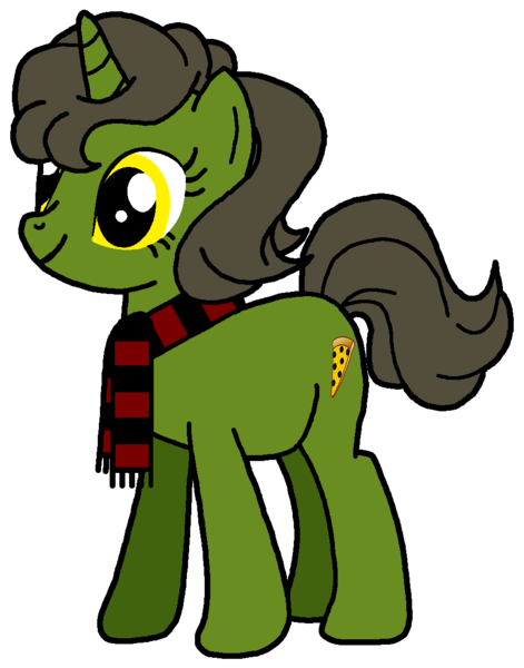
So I’ve stopped creating original characters (OCs) for a while because I want to focus on the show’s official characters, but I’ve started venturing back into the realm of OCs. Which is always sucky because I don’t know if I’m creating the characters too overpowered, too cliched, with a crappy design, etc.
There used to be a few blogs open on Tumblr that would critique OCs for you, most notably Fan-OC-Critique, but they have been inactive for two years now. So I’m wondering now, are there any other blogs one can use to get their OCs reviewed? Or is there a thread here for MLP OCs?
Thanks,
-Kirb.