Uploaded by Background Pony #C37A
3541x5016 PNG 10.83 MB
Interested in advertising on Derpibooru? Click here for information!
Help fund the $15 daily operational cost of Derpibooru - support us financially!
Description
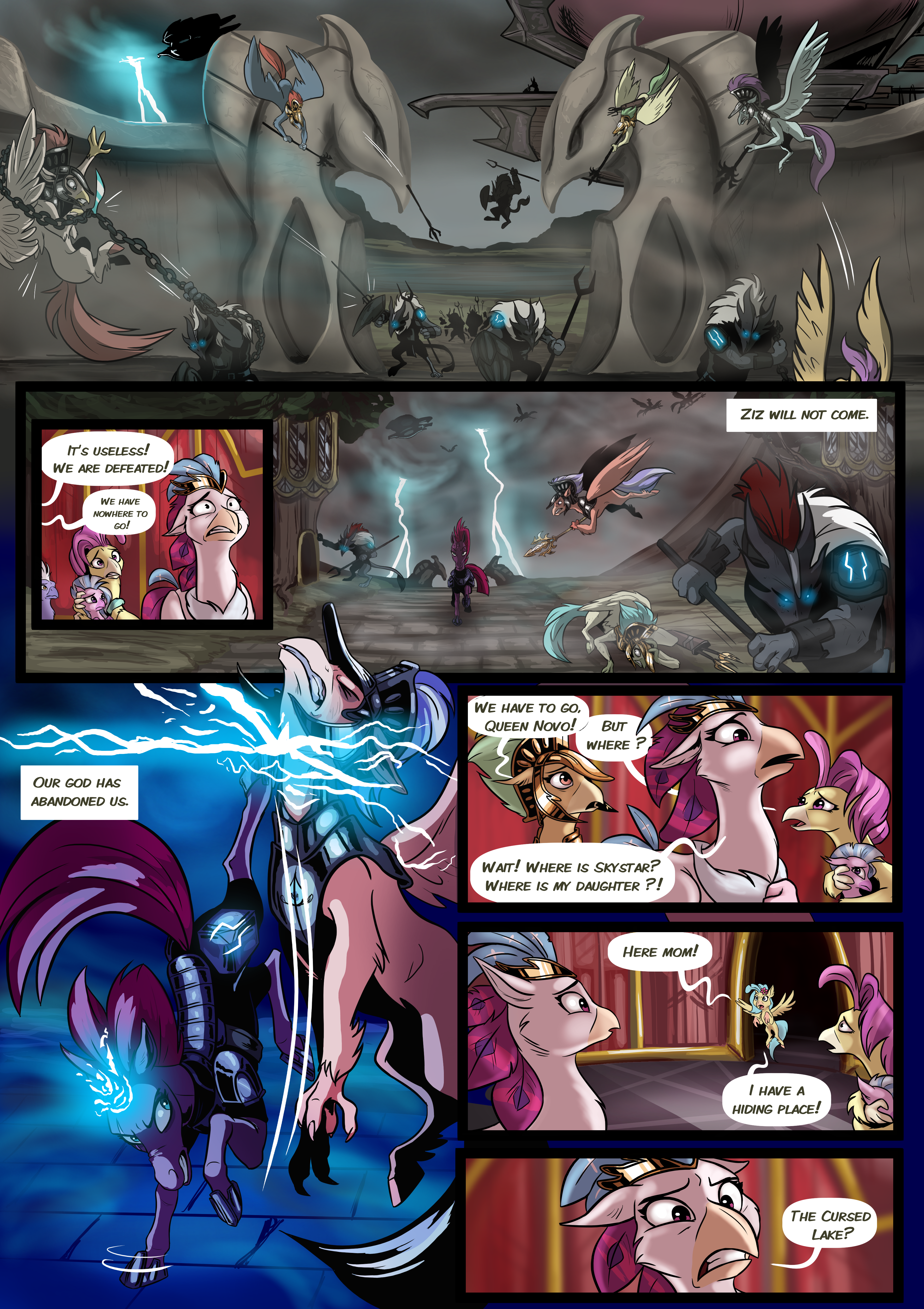
It’s a short comic about the fall of Hippogriffia. There will have only one page per month since it’s not the main project of the drawer, AlexVanArsdale.
Tags
+-SH safe2176210 +-SH artist:lummh778 +-SH ocean flow155 +-SH princess skystar2504 +-SH queen novo1884 +-SH silverstream7698 +-SH sky beak205 +-SH tempest shadow19014 +-SH hippogriff13556 +-SH pony1604395 +-SH unicorn538759 +-SH comic:twist of faith9 +-SH g42030979 +-SH my little pony: the movie21451 +-SH absurd resolution67493 +-SH airship1210 +-SH armor31233 +-SH background hippogriff103 +-SH broken horn15937 +-SH comic135543 +-SH female1804742 +-SH fight7447 +-SH hippogriff ocean flow13 +-SH horn191442 +-SH kicking2672 +-SH lightning4258 +-SH magic96738 +-SH male551433 +-SH mare742269 +-SH mount aris265 +-SH speech bubble39491 +-SH storm1118 +-SH storm guard404 +-SH storm king's emblem198 +-SH storm king's ship51 +-SH wings223442 +-SH young silverstream2
Loading...
Loading...
Haha! I love that! :D
Did you draw that one?
This is amazing and I want to see more of it.
Okay I hear you but

your current filter.That is where we disagree. You see a more realistic style would mean a longer nose. Also it has to do with a characters eyes and expression when seeing if they are reform material or not. Here she is in the heat of battle and the Hippogriffs are seeing her at her worst. So that’s also what I wanted to go for. I wanted her to look threatening not cute or good. I wanted that same dread you’d get from seeing Azula in Avatar show up. I kept a lot of qualities for Tempest when redesigning her. I wanted to feed more off the voice actress herself too.
I appreciate the realism. I like everything about this. Everything but the nose. That length hasn’t got anything to do with realism. You’re certainly making me see them in a different way, but not in a positive way. She just looks like she’s not even a pony. It’s quite a villainous look, a good design for her to have, if she was not planned to be redeemed and become a good character at the end… I guess you could change that ending though. So perhaps I should wait to complain depending on that.
Honestly, I love the realism. It fits better with the darker tone, for one, and secondly it really lets Tempest’s magic-fueled kick in the fourth panel carry some force behind it. Absolutely excited for the next installment!
Edit: Also, bonus points for the gryphon’s posture in that same panel. I know it’s a little detail, but having his chin snapping up while momentum carries the rest of him down just makes that scene pop.
Edited
Well as the artist for this comic I wanted to do something new with this and fresh. A different style and approach to the character and to see them in a different way. Tempest is drawn in a slightly more realistic style. The same style I’m using for the Hippogriffs.
If any pony could, it’s Tempest