Uploaded by DrakeyC .")


800x1237 PNG 1.04 MB
Interested in advertising on Derpibooru? Click here for information!
Help fund the $15 daily operational cost of Derpibooru - support us financially!
Description
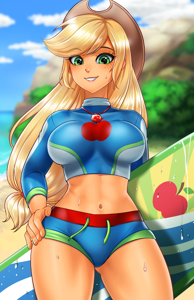
Edit of >>1900428 to have EqG-style skintone
Tags
+-SH safe2173831 +-SH artist:racoonsan660 +-SH color edit8954 +-SH edit172950 +-SH editor:drakeyc106 +-SH applejack200416 +-SH equestria girls255761 +-SH equestria girls series40540 +-SH forgotten friendship6503 +-SH g42028521 +-SH abs15784 +-SH adorasexy12742 +-SH applejack's hat14431 +-SH applejacked1654 +-SH beach22055 +-SH belly button110679 +-SH big breasts125670 +-SH breasts390864 +-SH busty applejack13986 +-SH clothes634254 +-SH colored24969 +-SH cowboy hat25711 +-SH cute265676 +-SH female1802173 +-SH freckles43848 +-SH geode of super strength2845 +-SH hat124195 +-SH jackabetes7940 +-SH jewelry112997 +-SH looking at you259175 +-SH magical geodes11629 +-SH midriff24352 +-SH muscles19073 +-SH necklace32328 +-SH ocean12644 +-SH sand3567 +-SH sexy45979 +-SH skin color edit240 +-SH solo1425635 +-SH stupid sexy applejack1286 +-SH surfboard1061 +-SH swimsuit39115 +-SH thighs28321
Source
not provided yet
Loading...
Loading...
Whatever. Have a nice day :/
You commented on a discussion that was long since resolved. You added zero to it by replying to me. So take your own advice and not say anything either.
If you got a problem with what they do just don’t say anything at all. Simple
Edited
Idk too but alright. Same to you!
You feel it’s a distraction without the accurate colouring? That’s actually pretty funny to me. Cause for me, it’s a distraction that it has the accurate colouring lol. Idk, whenever I see human mlp characters in their canon colouration, I’m self conscious about the fact I’m looking at art/r34/videos etc of cartoons specifically designed for children three times younger than me. It makes me feel dirty and that I shouldn’t be looking at it. But with the more human aesthetic, it makes it a lot easier for me to distract myself from the feeling of looking at stuff meant for little girls. Maybe it’s a masculine thing, idk.
Anyway, great chat with you my friend. I’m off to bed. Please, enjoy this art to your hearts content. Stay safe and wash your hands 👍👍👍
Personally, for me, the skin colors being anything other than EQG/pony colors is a bit of a distraction (obviously the art could still be amazing like this one) as it feels like a more of a cosplay as opposed to the actual character. And given that you don’t like EQG it makes sense that you’re opposed to the color swap.
The art style is still all there and yes the coloring is part of the art style but again like you and I both have said, preference.
Fair enough. You enjoy it, nothing I say will take that away from you. But it’s a downgrade through and through for me. I’m aware the original is still up and I prefer that over this infinitely. The outfit is from EQG sure, but the style of art is original and unique. That’s why making the colours of the characters match with their EQG counterparts is just bad imo. They look ugly and just uninspiring. Literally made me wanna vomit at how they looked. But I digress. It’s personal taste it boils down too. For me, it’s unnecessary. For you and others, it is. That’s cool. But I’m free to criticise something I feel is bad or just generic in my eyes as well. The editor did a good job however getting the skin tone to the shades AJ is, wont lie.
Well, the inspiration is taken from EQG. Literally the outfits from EQG.
And from my perspective, if you can edit a pic to make it more like something else (especially considering that it was already taking inspiration from it), why not?
And the other pic wasn’t removed when this one was uploaded, so you could over and admire that while us who do like EQG will be here admiring this much needed and upgraded pic. Perfect? I mean whatever floats your boat. It was perfect to you. To myself it was an incredible artpiece, but always prefer my pony characters as their original colors/eqg colors.
Well, some people like myself, dislike EQG. So it’s a definite downgrade. Like from my perspective, why ruin a perfectly good piece of art by trying to make it more like something else? I’ve seen the other edits of Racoonsan’s works and I just shake my head. It’s not needed when the art was already perfect.
Generic? It’s a skin tone change. More like EQG. Some people, like myself prefer that.
Not really, it was perfect the way it was. Now it’s just generic.
He made her more orange like, like her EQG colors.
Very much needed