Uploaded by wumbl3 


822x1122 JPG 499 kBInterested in advertising on Derpibooru? Click here for information!

Help fund the $15 daily operational cost of Derpibooru - support us financially!
Description
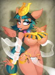
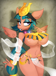
Let it be known that when I ask for critique up front, I listen to it.
So the far right face there is the most recently redone one, with all the critique I got about the second one in mind.
>Original >Redone Face >Redone Face TWO
So the far right face there is the most recently redone one, with all the critique I got about the second one in mind.
>Original >Redone Face >Redone Face TWO
Tags
+-SH suggestive190822 +-SH artist:lil miss jay2611 +-SH somnambula2417 +-SH pegasus497090 +-SH anthro360046 +-SH full service playing cards292 +-SH g42030509 +-SH bedroom eyes82198 +-SH belly dancer1116 +-SH breasts391437 +-SH busty somnambula260 +-SH clothes635103 +-SH curvy9864 +-SH cutie mark51435 +-SH egyptian1867 +-SH eyeshadow30157 +-SH female1804302 +-SH floating wings1647 +-SH freckles43986 +-SH hourglass figure2999 +-SH lipstick16742 +-SH loincloth1741 +-SH looking at you259617 +-SH makeup40451 +-SH menace21 +-SH no difference1 +-SH queen's blade40 +-SH see-through7504 +-SH smiling397863 +-SH solo1427154 +-SH solo female234702 +-SH stupid sexy somnambula57 +-SH underboob5116 +-SH underwear78897 +-SH wings223338
Loading...
Loading...


I can’t believe this is jay’s.
The origina’s the best really… way cuter.
i like your originals
However what appealed to the original design, is that the face looked more similar to ‘show style’ and you don’t see that a lot in anthro images at times. It’s what made it really good and highly liked.
But if we’re going for a change of pace to update your own personal style, design three is far better than two, and feels like it’s close to how you used to do it in the original, while still doing something unique to you.
It still does look more like a duck bill- but not in the same sense that it’s bad. It more so looks like an actual snout. In design two it looked like a square block and reminded me of horse face in all the wrong ways. I’ll take duck face over horse face- duck face is far better!
While I personally prefer the original designs rounded look that resembled show style shapes, I do approve of trying something new with ones art and experimenting with something new to keep things fresh.
I’m digging the narrower snout, too. It’s a good fit for the “springiness” of your style.
Edited
But I know basically nothing about art, so I’m not exactly the best judge.
Edited
inb4 “I like the second one better”
Which is fine