
Interested in advertising on Derpibooru? Click here for information!

Help fund the $15 daily operational cost of Derpibooru - support us financially!
Description
No description provided.
Help fund the $15 daily operational cost of Derpibooru - support us financially!
No description provided.
bro he’s been dead for like a year, let’s just move past that XD
you are not a pony of culture. google AHEGAO
Some ponies just have no taste in style. You keep drawing, It’s beatiful!
stfu nerd
I should clarify I was saying the anon was being pouty
No, no, I really appreciate the review of my image. You pointed out things I don’t even realize I do subconsciously as an artist. _ THIS is the type interactions I enjoy having with people who view my art. You weren’t hostile at all you said what you wanted to say in a professional manner. I myself could have handled it better, but I just got over a food poisoning episode and forced myself to draw this piece, hence why I might have taken a bit offensive to his comment. So with that said I do apologize to Background Pony #D16D to an extent.
Yeah I was just gonna leave it there but I did find that kind of a pouty. It was long but I obviously had a lot to say and I tried not to be hostile.
Now look who has the attitude…
@Background Pony #D16D
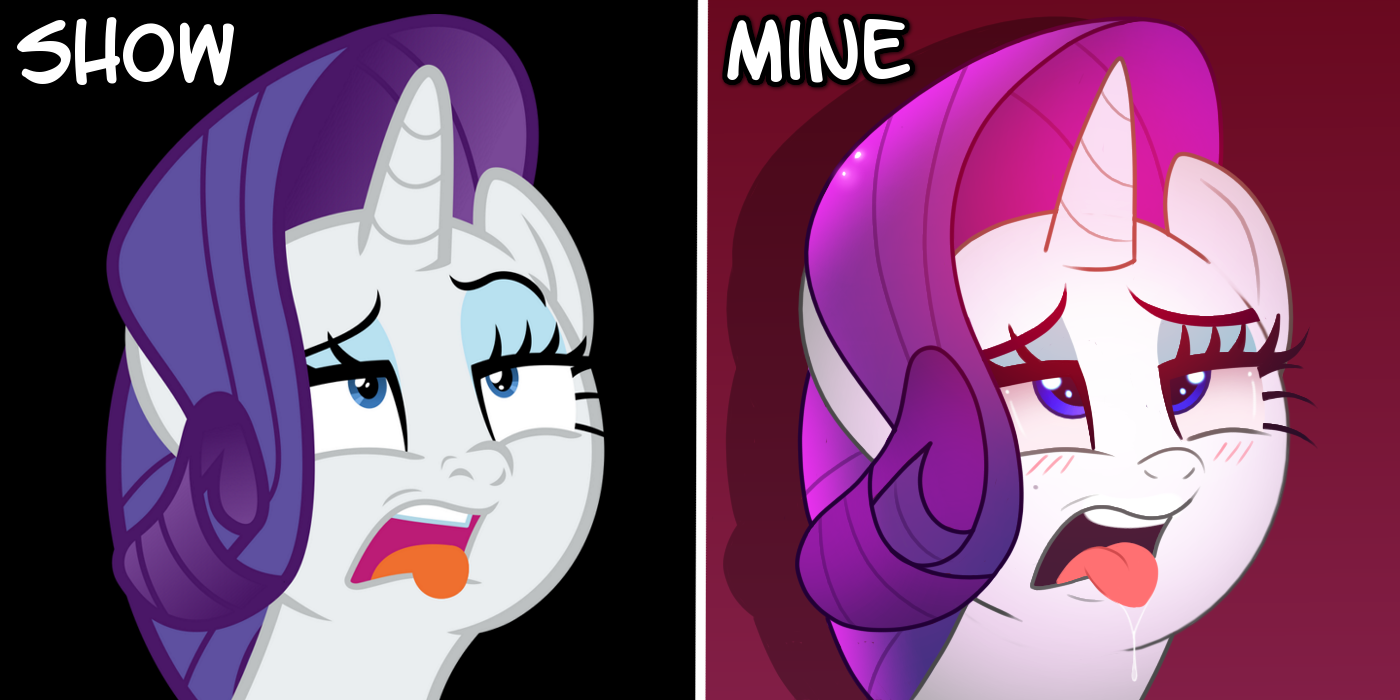
Now that’s a good critique and not because most of it was praise. You went in depth on why you like my version over the original. (Which was not the intention of this piece.) My intention of this piece was not to say “Mine’s better than the original.” But just to showcase my style and what most of my art consist of. Which is lewd humor half the time. Which is what most of my watchers know. So I feel like I should not have to “explain” my piece or write a damn diary of how long it takes me to draw something like I use to do. I just drew it and threw it out and said here enjoy. When I’ll ask for advice and critiques, I’ll ask for them and I have. The background pony’s critique was on the lines of “yeah this sucks ass cause I don’t like it.” With out any in-depth “ constructive criticism” Notice how I didn’t reply to the person that said “I like the original version better.” because that’s their opinion and that’s OK. I respect that. The end. In response to the ear Critique, yeah I agree the ear comes down too far to the head and I noticed this when drawing but I was like oh well because it was just a simple silly 30 minute drawing. I also noticed that her neck is a little too wide but no one has pointed out that yet. But I’ll be the first. lol Again this is the type of feedback I appreciate greatly; not because it was praising me but because it lets me know what I am doing right and what I am doing wrong not just what I am doing wrong and simply saying “I don’t like it. So therefore it’s a bad drawing.” But if you don’t like it. Cool whatever but don’t try to be little me over it.
Edited because: adding mention
k
Jesus christ dude calm down….
Even still I disagree completely with your criticism, I like this much better than the original. You opinion is your opinion and all, but still I can’t help but just think…wtf are you even talking about here?
I was actually surprised because its very rare for me to find someone’s art that I think is actually more visually appealing than the actual show. I don’t get why you have such a problem with the artist’s version of this.
Regardless, and I mean completely regardless of this weird nippy back and forth between you two, I seriously don’t agree with any of your points. I just….don’t.
I mean first - “Features are more refined and expressive in the original”? What you mean the ~ swirly eyelash? I don’t think that’s a matter of skill, that’s a matter of personal taste and tone, they went for a different shape clearly on purpose.
The most “expressive” thing that I see dumbed down here is really just the eyelash. Other than that there’s actually more expression in the artist’s version, but it’s coupled with a change of tone that I think you’re misinterpreting as “a lack of expression” - again mostly in the eyelash part.
I’ll explain.
The artist clearly went for a more suggestive tone as opposed to the original’s which is bordering more on a drunken/dazed tone. Because of that I don’t think Rarity B can fairly be called inferior to Rarity A because it’s less on that tone, you just like one tone or the other. The actual skill going into this work isn’t effected by that point, I don’t see that as constructive criticism, the artist went for something else and I think they nailed it. It’s a lewdie pic.
Basically the direction/shape of the eyelashes in the original had a certain almost angsty tone and that was replaced by a more “I’m giving in to extreme pleasure” one. And personally I see that as an improvement when combined with other changes.
This tone intention is most evident in the obvious blush emotive. This is part of what made me confused when you said her original face was more “expressive”, but I will admit this doesn’t take much skill to do, it’s just a tone indicator. I don’t think it’s important but I like it being there.
But as for the actual shapes, I really don’t get your criticism because I see the face in general being both cuter and more detailed in some areas on the artist’s version vs the original. For example, the nose. The nose, to me, looks a little too human for my taste in the original, whereas the artist’s version looks cuter to me. Being more complicated doesn’t always mean it’s better. The nose is a little rounder, because I guess the artist wanted less emphasis on the “eeeuhhh” and more on the lewdie.
The detail on the mouth is dramatically more detailed in version B. I literally don’t think there is an objective way to say otherwise. And unlike the nose of the original, which to me looks less appealing despite being more complicated, the additional features of the mouth here in Rarity B make the image more appealing to me. It’s rounder in shape, again more cute looking, but the tongue itself actually is more defined, and looks a little more real as opposed to the show’s canon orange slime blob shape. There’s also a small added detail on the lower lip to imply muscle contraction, which makes it feel a little more natural. Not to mention the teeth are a little rounder and cuter, and there’s also a saliva drip added to the tongue, to further the lewdie tone even more.
There is only one detail on Rarity A’s mouth that’s been removed for Rarity B, and that’s this very small downward slope past her tongue. I agree with the decision to remove this though, because this, combined with the additional upward shape in the lower left, make for less emphasis on a frown in the mouth which I think brings the whole expression a bit more appealing.
The neck is also a bit rounder and less stiff.
The head is mostly the same shape, though the hair I’m torn on, I think I like the thicker outline of the canon picture. Also the ear seems a little too large on her left side, but I honestly didn’t notice that.
The eyes though, I really, really don’t get your criticism of this. I don’t see how Rarity A’s smaller eyes are more appealing. The eyes in Rarity B are a bit larger and cuter, and the cross-eyed expression is a common lewdie thing. To put it simply, it means “BIG UNF”. A naughty thing is happening, she feels really good. That’s the point of the lewdie suggestion. It’s an Ahegao face.
Not to mention there’s also more detail on the eyeball itself, around the iris, to make it stand out more from the white color of her coat. Some shiney shines were added and the eyes were rounded just a bit, and there’s a very slight change in color of white. This is a much better detail than Rarity A, it’s a more natural looking style that still manages to be cute and cartoony, if not even more cute and cartoony.
At any rate, considering all of this, if this image really was a 30 minute challenge or whatever that makes it even better imo. Again, your opinion is your opinion just like my opinion is my opinion, but still I really don’t get what you’re coming from and I don’t see your criticism as constructive or even objective. Just….ehh?
Anyway sorry for the giant wall but seriously…. I was so confused by your criticism I took on the challenge to really look - and I mean REALLY REALLY look hard at this art to see what you’re talking about but I just don’t see the problem. Not any of the ones you’re talking about at least. This just looks…SO much better to me I don’t even get it. It’s like the only objective problem I can see at all is one of the ears.
Edited
Don’t give me that attitude. You did not state anywhere - neither here nor on DA - that it was a “30 minute warm up drawing”, therefore I am inclined to believe it was not a 30 minute drawing and that you are in fact just making an excuse to shrug off the critique. That is unprofessional behaviour, but hey, whether you want to improve or not is up to you.
So… you’re critiquing a 30 minute warm up drawing I did? Okay then.
yes
No.