
Interested in advertising on Derpibooru? Click here for information!

Help fund the $15 daily operational cost of Derpibooru - support us financially!
Description
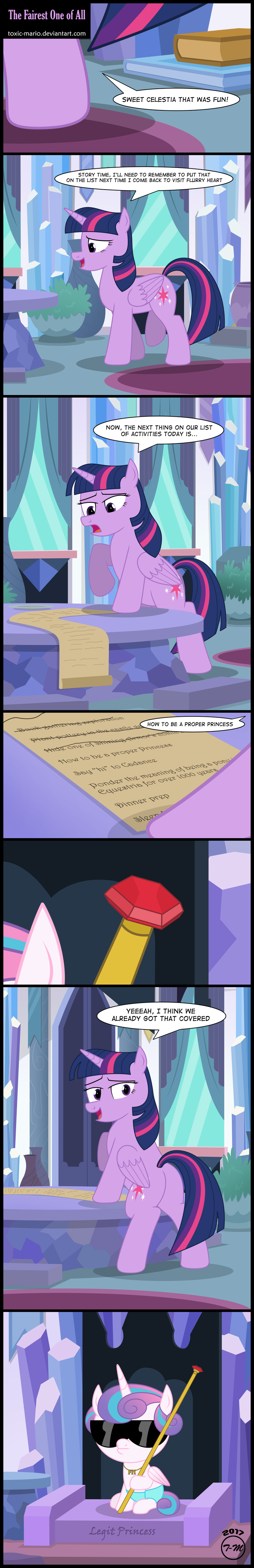
Oh look what we have here. Another Flurry Heart comic. :D So here’s the thing this comic I actually did about 90% of this comic about….oh……I think like a more than a month ago. I actually don’t even know why in the world the direction of this comic came from but I will say this was one hell of a hard comic to figure out what on earth I wanted to do. I remember having soooooo many different way to take this comic and I was stressing for about a good week while working on another comic in the off-season at the time figuring out what to do with this episode. Nothing entirely stuck so as per it seems like the trend will be this season is to just weird the absolutely crap out of them. :P Muffin is fairly easy in this one. I will be ashamed if not everyone sees it. :|
Ok so once again….I HATE the crystal empire and the backgrounds to make for it. They have NOTHING in them in the show. Seriously…go back in the show and look at one of the EPs eve with the EP with Thorax….they are LITERALLY empty rooms and those type of basic rooms the show gives me offer no help for trying to come up with crap to put into the rooms. Yes I have more freedom but with a setting like this it’s much harder to pick and choose what looks good to fit there and what doesn’t. It’s easily one of the more harder backgrounds I do make here and there….with Twilight Castle Still being the harder background since S4…yes it finally overtook the library in my early years of pony finally. :faint: Oh you know what…I didn’t want to go super…and I mean super overly crazy on the Swaggy Flurry Heart design but I swear there is something about putting those Dash glasses on them as fillies that make it work so well. Remember the OLD and I mean OLD Dash comic I did of 2012 with Dash? Yeah….filly ponies and baby ponies in this case look good with overly big glasses. :P I almost should make that last panel into a print but with no pony cons for me in 2017 I will probably put it online this week or something if the interest is there when I update my online store.
Alright so…..Episode 3. Something tells me this season is gonna fly on by. Next week is gonna be a huge HUGE important week cause I am on a one on one with one of the National Weather Service heads of the office in my city so….pending on what he advises me or stuff it could be interesting to see how this may affect me and pony going forward. I won’t know until Wednesday afternoon so we’ll see sooner rather than later. I been stressing on this a little but it’s fine cause that’s where my dream job has always been. :) Anyway onward to EP 4…..a Derpy comic awaits.
My Biggest problem with his ponies is that they all look way to masculine
They don’t have the smooth curves a female should have and yeah they look fat and a bit ugly
And you are spot on with the whole muzzel problem
Yup, proportionwise his ponies are just all over the place. No wonder he makes them lean or lay down all the time. Only time they look a bit decent.
Also, he can say that it’s his style but critiques should be accepted if almost everyone says it. Or atleast show that he acknowledges them.
oh my god that’s amazing! XD
You’re right and you aren’t the first one to notice the problem.
>>1382446p (deleted)
@saturnstar14
I noticed part of the problem while sketching over his twilight in photoshop.
In frame 6 Twilight looks especially weird, that’s because with the way her head is facing her muzzle should more or less be pointing in the direction her eyes are pointing, since a pony muzzle is an extension of the face, it juts out forward from the face.
In this picture her face is looking past the viewer but her muzzle is going in the other direction, almost as if tox just copy pasted the muzzle from a side facing pony.
look at this fluttershy, her muzzle in the dead center of her face and her eyes are going towards the camera and just off to the right a bit
https://lh3.googleusercontent.com/-2gOuZrP9o0k/V1xbJ3ORDWI/AAAAAAAAAFY/WMz-EvoxE9wA5_Y7kauyC50hRJQPAvWag/w800-h800/full.png
(don’t know how to link images sorry)
Look at this Rarity
https://s-media-cache-ak0.pinimg.com/736x/3b/27/c9/3b27c9b7cf86c10f38afb8b20ef0c0c3.jpg
It’s a 3/4 head turn, a little more like the one tox drew, but notice how the eye that’s further away is considerably smaller and the muzzle is following the curve of the face?
Even if I’m wrong, because a lot of art is up to personal styles. You could spend hours arguing about the placement of facial features, But it’s the fact that the muzzle comes out so damn far and at imposisble angles. If you just type in ‘mlp looking back” on google you see none of the muzzles ever go past the facial circle, and even if they do, they’re only poking out a little bit.
it just further supports my assumption that he’s not caring and cutting corners to get the picture made, because every picture has their muzzles going off in weird fuckin directions and makes them look like their facial bones have been severely broken.
If he wants to fix his reputation, which i think is very doable, he needs to go back and get a better grasp on the fundamentals of pony drawing.
I’m not trying to tear him down out of anger or hatred. I’m just stating the facts. His ponies look weird. it’s 67 degrees outside and his ponies look weird.
Edited
Well said, man. Well said.
Wouldn’t say a donkey but it definitly looks off. Glad we’re agreeing on something for once.
He’s had this style for months, if not years, and it just makes me feel so uncomfortable. His hooves are too fat, they have none of the curves you see in the show, his bodies are too fat, they almost never have necks. But what is the most jarring are the muzzles and facial details.
On any pony you see, in the show or in fan art, the muzzle usually comes out from the horizontal crosshair of the facial circle and the curve of the muzzle follows the curve of the head. Tox’s muzzles jut out of the head at weird angles and just do whatever when going back into the neck. Almost every pony has the same open mouth expression, which jsut makes them look like they’re crying out in pain, and then there’s no reaction from the rest of the face. For their mouths to be open that wide there’d be some effect happening to the cheek, probably pushing it up into the eyes, but there’s nothing. And speaking of eyes, they all have these huge slceras and tiny pupils by comparison.
it all just feels gross, and it’s been in every picture for like the past couple years. It almost feels like he’s stopped caring because his drawings looked nothing like this back between 2012 to 2014.
I’m not trying to be mean, cause tox and I are friends. I even tried giving him some advice like maybe do some sketches or physical drawings and port them into illustrator but he just said it’s the ‘style’ he’s going for.
Well it’s not a visually appealing style, cause everything just feels uncomfortable. Like that uncanny valley effect. You know it’s Twilight, it looks like Twilight, but something’s wrong and she looks like a donkey for some reason.
shrugs
Edited
She didn’t choose the princess life, the princess life chose her.